The Kaggle Higgs Challenge – Beat the benchmarks with scikit-learn

This post is intended as a quick-start guide to getting a competitive score in the Higgs Boson Machine Learning Challenge, using just a bit of python and scikit-learn.

The data consists of just a training.csv and test.csv file. Each of these has a column of ID numbers and 30 columns of feature quantities. Each row represents an event which is either a signal higgs event (s) or a background event (b). The training.csv indicates the truth value (s or b) as well as an event weight.

The goal of this challenge is to classify the events as signal in a manner that optimizes a certain metric. The metric for this challenge is the AMS metric, which is a function of the weighted numbers of correctly and incorrectly guessed signal events.

My approach is pretty simple. I am using the gradient boosting classifier, and I am using the probability output for each event to rank the events. I don’t take the classification at face value – I make a cutoff on the probability prediction and call the upper 15% of events as signal. You can optimize this threshold to maximize the AMS, but after a few tests I have found that the upper 15% is usually about right.

I divide the training sample, keeping 90% as training, and 10% as validation. I calculate the AMS on both to check for overtraining.

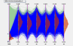
To check that the results look reasonable, I also plot the probability prediction. The red is training background, and the blue is training signal. The black dots are the testing data, normalized to the training sample. I haven’t applied any event weights, because we don’t know these in the test data. The blue shaded region is the upper 15% which I call signal to maximize the AMS metric.

The probability prediction for training signal and background, as well as on testing data, based on the gradient boosting classifier.

The probability prediction for training signal and background, as well as on testing data, based on the gradient boosting classifier.

Without further ado, this is the code. It should predict in AMS of about 3.47, and the submission scored about 3.38 (either due to random fluctuation or a tiny bit of overtraining). It runs in 5 minutes for me. I am using sklearn 0.14.1 and python 2.7.3.

import numpy as np
from sklearn.ensemble import GradientBoostingClassifier as GBC
import math

# Load training data
print 'Loading training data.'
data_train = np.loadtxt( 'training.csv', delimiter=',', skiprows=1, converters={32: lambda x:int(x=='s'.encode('utf-8')) } )

# Pick a random seed for reproducible results. Choose wisely!
np.random.seed(42)
# Random number for training/validation splitting
r =np.random.rand(data_train.shape[0])

# Put Y(truth), X(data), W(weight), and I(index) into their own arrays
print 'Assigning data to numpy arrays.'
# First 90% are training
Y_train = data_train[:,32][r<0.9]
X_train = data_train[:,1:31][r<0.9]
W_train = data_train[:,31][r<0.9]
# Lirst 10% are validation
Y_valid = data_train[:,32][r>=0.9]
X_valid = data_train[:,1:31][r>=0.9]
W_valid = data_train[:,31][r>=0.9]

# Train the GradientBoostingClassifier using our good features
print 'Training classifier (this may take some time!)'
gbc = GBC(n_estimators=50, max_depth=5,min_samples_leaf=200,max_features=10,verbose=1)
gbc.fit(X_train,Y_train) 

# Get the probaility output from the trained method, using the 10% for testing
prob_predict_train = gbc.predict_proba(X_train)[:,1]
prob_predict_valid = gbc.predict_proba(X_valid)[:,1]

# Experience shows me that choosing the top 15% as signal gives a good AMS score.
# This can be optimized though!
pcut = np.percentile(prob_predict_train,85)

# This are the final signal and background predictions
Yhat_train = prob_predict_train > pcut 
Yhat_valid = prob_predict_valid > pcut

# To calculate the AMS data, first get the true positives and true negatives
# Scale the weights according to the r cutoff.
TruePositive_train = W_train*(Y_train==1.0)*(1.0/0.9)
TrueNegative_train = W_train*(Y_train==0.0)*(1.0/0.9)
TruePositive_valid = W_valid*(Y_valid==1.0)*(1.0/0.1)
TrueNegative_valid = W_valid*(Y_valid==0.0)*(1.0/0.1)

# s and b for the training 
s_train = sum ( TruePositive_train*(Yhat_train==1.0) )
b_train = sum ( TrueNegative_train*(Yhat_train==1.0) )
s_valid = sum ( TruePositive_valid*(Yhat_valid==1.0) )
b_valid = sum ( TrueNegative_valid*(Yhat_valid==1.0) )

# Now calculate the AMS scores
print 'Calculating AMS score for a probability cutoff pcut=',pcut
def AMSScore(s,b): return  math.sqrt (2.*( (s + b + 10.)*math.log(1.+s/(b+10.))-s))
print '   - AMS based on 90% training   sample:',AMSScore(s_train,b_train)
print '   - AMS based on 10% validation sample:',AMSScore(s_valid,b_valid)

# Now we load the testing data, storing the data (X) and index (I)
print 'Loading testing data'
data_test = np.loadtxt( 'test.csv', delimiter=',', skiprows=1 )
X_test = data_test[:,1:31]
I_test = list(data_test[:,0])

# Get a vector of the probability predictions which will be used for the ranking
print 'Building predictions'
Predictions_test = gbc.predict_proba(X_test)[:,1]
# Assign labels based the best pcut
Label_test = list(Predictions_test>pcut)
Predictions_test =list(Predictions_test)

# Now we get the CSV data, using the probability prediction in place of the ranking
print 'Organizing the prediction results'
resultlist = []
for x in range(len(I_test)):
	resultlist.append([int(I_test[x]), Predictions_test[x], 's'*(Label_test[x]==1.0)+'b'*(Label_test[x]==0.0)])

# Sort the result list by the probability prediction
resultlist = sorted(resultlist, key=lambda a_entry: a_entry[1]) 

# Loop over result list and replace probability prediction with integer ranking
for y in range(len(resultlist)):
	resultlist[y][1]=y+1

# Re-sort the result list according to the index
resultlist = sorted(resultlist, key=lambda a_entry: a_entry[0])

# Write the result list data to a csv file
print 'Writing a final csv file Kaggle_higgs_prediction_output.csv'
fcsv = open('Kaggle_higgs_prediction_output.csv','w')
fcsv.write('EventId,RankOrder,Class\n')
for line in resultlist:
	theline = str(line[0])+','+str(line[1])+','+line[2]+'\n'
	fcsv.write(theline) 
fcsv.close()

Lastly, if you are interested in drawing the distribution as I have, this is the code:


from matplotlib import pyplot as plt

Classifier_training_S = gbc.predict_proba(X_train[Y_train>0.5])[:,1].ravel()
Classifier_training_B = gbc.predict_proba(X_train[Y_train<0.5])[:,1].ravel()
Classifier_testing_A = gbc.predict_proba(X_test)[:,1].ravel()
 
c_max = max([Classifier_training_S.max(),Classifier_training_B.max(),Classifier_testing_A.max()])
c_min = min([Classifier_training_S.min(),Classifier_training_B.min(),Classifier_testing_A.min()])
 
# Get histograms of the classifiers
Histo_training_S = np.histogram(Classifier_training_S,bins=50,range=(c_min,c_max))
Histo_training_B = np.histogram(Classifier_training_B,bins=50,range=(c_min,c_max))
Histo_testing_A = np.histogram(Classifier_testing_A,bins=50,range=(c_min,c_max))
 
# Lets get the min/max of the Histograms
AllHistos= [Histo_training_S,Histo_training_B]
h_max = max([histo[0].max() for histo in AllHistos])*1.2
# h_min = max([histo[0].min() for histo in AllHistos])
h_min = 1.0
 
# Get the histogram properties (binning, widths, centers)
bin_edges = Histo_training_S[1]
bin_centers = ( bin_edges[:-1] + bin_edges[1:]  ) /2.
bin_widths = (bin_edges[1:] - bin_edges[:-1])
 
# To make error bar plots for the data, take the Poisson uncertainty sqrt(N)
ErrorBar_testing_A = np.sqrt(Histo_testing_A[0])
# ErrorBar_testing_B = np.sqrt(Histo_testing_B[0])
 
# Draw objects
ax1 = plt.subplot(111)
 
# Draw solid histograms for the training data
ax1.bar(bin_centers-bin_widths/2.,Histo_training_B[0],facecolor='red',linewidth=0,width=bin_widths,label='B (Train)',alpha=0.5)
ax1.bar(bin_centers-bin_widths/2.,Histo_training_S[0],bottom=Histo_training_B[0],facecolor='blue',linewidth=0,width=bin_widths,label='S (Train)',alpha=0.5)

ff = (1.0*(sum(Histo_training_S[0])+sum(Histo_training_B[0])))/(1.0*sum(Histo_testing_A[0]))

# # Draw error-bar histograms for the testing data
ax1.errorbar(bin_centers, ff*Histo_testing_A[0], yerr=ff*ErrorBar_testing_A, xerr=None, ecolor='black',c='black',fmt='.',label='Test (reweighted)')
# ax1.errorbar(bin_centers, Histo_testing_B[0], yerr=ErrorBar_testing_B, xerr=None, ecolor='red',c='red',fmt='o',label='B (Test)')
 
# Make a colorful backdrop to show the clasification regions in red and blue
ax1.axvspan(pcut, c_max, color='blue',alpha=0.08)
ax1.axvspan(c_min,pcut, color='red',alpha=0.08)
 
# Adjust the axis boundaries (just cosmetic)
ax1.axis([c_min, c_max, h_min, h_max])
 
# Make labels and title
plt.title("Higgs Kaggle Signal-Background Separation")
plt.xlabel("Probability Output (Gradient Boosting)")
plt.ylabel("Counts/Bin")

# Make legend with smalll font
legend = ax1.legend(loc='upper center', shadow=True,ncol=2)
for alabel in legend.get_texts():
            alabel.set_fontsize('small')
 
# Save the result to png
plt.savefig("Sklearn_gbc.png")

An elastic-mapreduce streaming example with python and ngrams on AWS

Overview

This is meant as a tutorial to running an elastic-mapreduce job on AWS, from scratch. You can find lots of resources on this, but this is intended as a start-to-finish guide.

We are going to use google ngrams to look for words which were coined in the year 1999 – and we are going to do it with streaming mapreduce in python.

Furthermore, we are going to do it from scratch, assuming you’ve never used AWS at all. That means everything including:

  • Getting an account and S3 storage bucket
  • Using s3cmd to interact with S3
  • Downloading data from google and uploading to S3 from an EC2 instance
  • Setting up the elastic-mapreduce command line interface (CLI)
  • Understanding the data, and writing a mapper and reducer
  • Submitting jobs from the command line, and retrieving output.


Disclaimer: AWS costs money. Make sure you don’t leave instances running that you aren’t using, and don’t occupy S3 space that you don’t need. This tutorial is for educational purposes only. In the process of trying this code and a few other things, it cost me about 4 dollars.


Getting Started

  1. First you will need to make your account at http://aws.amazon.com/ – you will need a phone number and credit card. This exercise shouldn’t cost more than a couple dollars.
  2. Then go to http://console.aws.amazon.com/ec2 . Under  “Network & Security” click  “Key Pairs” and then click “Create Key Pair”. Name it MyKeyPair and download it (I will asume it goes to the ~/Downloads/ directory.)
  3. Next, let’s make a local working directory and put your key there. As such:
          mkdir MyAWSTest
          cd MyAWSTest
          cp ~/Downloads/MyKeyPair.pem .
          chmod 700 MyKeyPair.pem
          
  4. Then, download and setup the elastic-mapreduce command-line interface
    mkdir EMR
    cd EMR
    wget http://elasticmapreduce.s3.amazonaws.com/elastic-mapreduce-ruby.zip
    unzip elastic-mapreduce-ruby.zip
    
  5. Still in the EMR directory, make a credentials.json file. For this you will need your access ID and private key from https://console.aws.amazon.com/iam/home?#security_credential ( click on access keys and click download key file.) My credentials.json looks like:

    {
    "access_id": "YOURACCESSIDHERE",
    "private_key": "YOURPRIVATEKEYHERE",
    "keypair": "MyKeyPair",
    "key-pair-file": "/PATH/TO/YOUR/WORKINGDIRECTORY/MyAWSTest/MyKeyPair.pem",
    "region": "us-west-2"
    }

  6. The last setup item is installing s3cmd, a convenient command-line tool for access s3 from your local computer. I am on an ubuntu-based linux distro, so this is easy. You will need to configure once with your access ID and private key from the previous step
    sudo apt-get install s3cmd
    s3cmd --configure
    

Writing map and reduce code in python

We can write map and reduce code in python, which will take the ngrams data files, map the lines into a more useful format, and reduce them to our desired result. To get a better idea of this, let’s look at a small subset of the data. To do so, we will download and glance at the 1grams beginning with the letter “x”:

wget http://storage.googleapis.com/books/ngrams/books/googlebooks-eng-all-1gram-20120701-x.gz
gunzip googlebooks-eng-all-1gram-20120701-x.gz
head googlebooks-eng-all-1gram-20120701-x

Which displays:

X’rays 1914 1 1
X’rays 1917 1 1
X’rays 1919 1 1
X’rays 1921 1 1
X’rays 1922 2 1
X’rays 1923 1 1
X’rays 1927 1 1
X’rays 1930 5 3
X’rays 1931 2 2
X’rays 1932 3 2

Here we can see some of the early appearances of xrays in the 1900’s. The first column is the word, the second is the year it appeared, the third is the total number of occurrences, and the last is the number of distinct books it occurred in.

We are going to look for normal words (consisting of alphabetic characters only), and see which words started occurring in the year 1999. So we will ignore the last column for this exercise.

The first stage of map-reduce is the mapper. Here we will clean up the word (make lower case, get rid of weird words with special characters, etc), and simply output the clean word, the year, and the number of occurrences. Code for a mapper is like this:

#!/usr/bin/env python

import sys

def CleanWord(aword):
	"""
	Function input: A string which is meant to be
	   interpreted as a single word.
	Output: a clean, lower-case version of the word
	"""
	# Make Lower Case
	aword = aword.lower()
	# Remvoe special characters from word
	for character in '.,;:\'?':
		aword = aword.replace(character,'')
	# No empty words
	if len(aword)==0:
		return None
	# Restrict word to the standard english alphabet
	for character in aword:
		if character not in 'abcdefghijklmnopqrstuvwxyz':
			return None
	# return the word
	return aword

# Now we loop over lines in the system input
for line in sys.stdin:
	# Strip the line of whitespace and split into a list
	line = line.strip().split()
	# Use CleanWord function to clean up the word
	word = CleanWord(line[0])

	# If CleanWord didn't return a string, move on
	if word == None:
		continue

	# Get the year and the number of occurrences from
	# the ngram line
	year = int(line[1])
	occurrences = int(line[2])

	# Print the output: word, year, and number of occurrences
	print '%s\t%s\t%s' % (word, year,occurrences)

The next step is the reducer. It will take the output of the mapper (which is sorted alphabetically), and run through it. Our goal is to add up the pre-1999 occurrences and the 1999 occurrences, and if the word only occurred in 1999, we will output it. It’s pretty straightforward:

#!/usr/bin/env python
import sys

# current_word will be the word in each loop iteration
current_word = ''
# word_in_progress will be the word we have been working
# on for the last few iterations
word_in_progress = ''

# target_year_count is the number of word occurrences
# in the target year
target_year_count = 0
# prior_year_count is the number of word occurrenes
# in the years prior to the target year
prior_year_count = 0

# Define the target year, in our case 1999
target_year = 1999

# Loop over lines of input from STDIN
for line in sys.stdin:

	# Get the items in the line as a list
	line = line.strip().split('\t')

	# If for some reason there are not 3 items,
	# then move on to next line
	if len(line)!=3:
		continue

	# The line consists of a word, a year, and
	# a number of occurrences
	current_word, year, occurrences =  line

	# If we are on a new word, check the info of the last word
	# Print if it is a newly minted word, and zero our counters
	if current_word != word_in_progress:
		# Word exists in target year
		if target_year_count > 0:
			# Word doesn't exist in target year
			if prior_year_count ==0:
				# Print the cool new word and its occurrences
				print '%s\t%s' % (word_in_progress,target_year_count)

		# Zero our counters
		target_year_count = 0
		prior_year_count = 0
		word_in_progress = current_word

	# Get the year and occurences as integers
	# Continue if there is a problem
	try:
		year = int(year)
	except ValueError:
		continue
	try:
		 occurrences = int(occurrences)
	except ValueError:
		continue

	# Update our variables
	if year == target_year:
		target_year_count += occurrences
	if year < target_year:
		prior_year_count += occurrences

# Since the loop is over, print the last word if applicable
if target_year_count > 0:
	# Word doesn't exist in target year
	if prior_year_count ==0:
		# Print the cool new word and its occurrences
		print '%s\t%s' % (word_in_progress,target_year_count)


A local test of the code

Remember our “x” 1gram data that we downloaded? We can use that to test the code. You’ll note that the code used the “stdin” – this is equivalent to just “cat”ing the file, and taking that streaming input line by line. This is what hadoop or elastic-mapreduce will do, so this is what we can try in the command line:

cat googlebooks-eng-all-1gram-20120701-x | ./mapper.py  | sort -k1,1 | ./reducer.py | sort -k2,2n

So, the mapper is run on the streaming input, and the output is sorted, and the reducer is run on that. The end is just a sort that I introduced which will put the most common output last – these are the words created in 1999 which were used the most. Example output is:

xdcam 25
xmlparser 83
xadatasource 338

As you might expect from “x” words – these are mostly tech words. Now we can try a similar test with elastic-mapreduce.


An EMR test of the code

First, we can use s3cmd to upload our necessary files to S3. This is very easy. We make a bucket called “ngramstest” and then upload out mapper, reducer, and data file to the bucket.

s3cmd mb ngramstest

s3cmd put reducer.py s3://ngramstest/code/reducer.py
s3cmd put mapper.py s3://ngramstest/code/mapper.py
s3cmd put googlebooks-eng-all-1gram-20120701-x s3://ngramstest/input/NGramsX.txt

Then, we can use these inputs to launch an EMR job. From the EMR directory:

./elastic-mapreduce --create --stream \
--input s3n://ngramstest/input \
--output s3n://ngramstest/output-streaming-full-cli \
--mapper s3n://ngramstest/code/mapper.py \
--reducer s3n://ngramstest/code/reducer.py

Now it it is just a matter of waiting a couple minutes. Here are the commands to check your status and view the results when it is complete:

# Check status
./elastic-mapreduce --list
# When done, ls the output, and copy the output file locally.
s3cmd ls s3://ngramstest/output-streaming-cli/
s3cmd get s3://ngramstest/output-streaming-cli/part-00000 results.txt
# We can view the results just as before!
cat results.txt | sort -k2,2n

Getting lots of data

The google ngrams are on S3 already, but elastic-mapreduce streaming can read from compressed files, as long as we have the file extension in the name. Unfortunately, the files provided do not 😦

But no worries, we can do it from scratch! To make this process faster, we can launch an EC2 instance for a few moments, and run a script to download the data and move it to S3.

To launch an EC2 instance:

  • Go to console.aws.amazon.com/ec2 and click the big blue “Launch Instance” button
  • Choose and AMI (Machine Image). I chose Amazon Linux AMI 2014.03 – ami-b8f69f88 (64-bit)
  • The next step will be choosing an instance type. I chose “General Purpose” m1.small. More info at: http://aws.amazon.com/ec2/instance-types/
  • Just hit “Review and launch”
  • Click “Launch” to launch the instance. When prompted, select your key pair “MyKeyPair”.

From the EC2 console you can get the Public DNS, and use it to ssh into the instance. My command looked like this, but switch out your Public DNS:

ssh ec2-user@ec2-54-186-211-19.us-west-2.compute.amazonaws.com -i MyKeyPair.pem

Once logged in, do
“aws configure” and fill out the “AWS Access Key” prompt and “AWS Secret Access Key” prompt. This will allow you to interact with S3 from the ssh session.

Make a folder “ngramstest/input_gz” from the AWS S3 console.
Now it is just a matter of downloading the google 1grams data for all of the alphabet and putting it your S3 folder. I made this quick script to do that:

import os
for letter in 'abcdefghijklmnopqrstuvwxyz':
	ngram_file = 'googlebooks-eng-all-1gram-20120701-'+letter+'.gz'
	os.system('wget http://storage.googleapis.com/books/ngrams/books/'+ngram_file)
	os.system('aws s3 cp '+ngram_file+' s3://ngramstest/input_gz/'+ngram_file)
	os.system('rm  '+ngram_file)

Now we have all the data we need! Exit the ssh session, and be sure to stop or terminate the m1.small session from the AWS console. You are paying 6 cents an hour for it, after all!


Launch the full map-reduce work

This is similar to our previous tests, except now we will run on the full dataset. This is now using 5 instances.

./elastic-mapreduce --create --stream \
--input s3n://ngramstest/input_gz \
--output s3n://ngramstest/output-streaming-fullrun \
--mapper s3n://ngramstest/code/mapper.py \
--reducer s3n://ngramstest/code/reducer.py \
--num-instances 5

Wait for the job to finish. Then you can get the output, and read it!

s3cmd get s3://ngramstest/output-streaming-fullrun/part*
cat part*  | sort -k2,2n

A few of the more interesting results:


Thanks to http://www.michael-noll.com/tutorials/writing-an-hadoop-mapreduce-program-in-python/ for a brilliantly simple python streaming example.

Hashtags in Common: Visualizations with Python and TwitterSearch

If you actively use twitter, you probably know that it’s common for tweets to have several hashtags. If you search for tweets with a particular hashtag, you often see other related hashtags repeating over and over again as certain topics trend together.

If that information was distilled down to a single graphic that tells you what hashtags are frequently occurring together, you could easily get some quick insight about current related news or cultural items. The topic of today’s post will be making such a graphic.

But first, we will need to build a little machinery to get the job done. I’ll be using the TwitterSearch API for python to get the data, and matplotlib/pyplot for displaying results. This is the full set of imports:

from TwitterSearch import *
import matplotlib.pyplot as plt
import collections,sys,math 

Step 1: Parsing the tweet.

Tweets can be ugly, and I don’t mean in their verbal content. In an ideal world, we would be streaming in tweets that look like:

New #cosmos series is great public outreach for #science and #physics

But often what we see are things like:

WOAH just saw #COSMOs #Science!!#physics.

So, we have some cleaning to do. What we need is a function that separates hashtags from other words, puts everything in the same case, cleans punctuation, removes possessives (like “#obama’s statement”), etc. This is my solution:


def FindHashHags(tweet):
	"""
	This function takes the twittersearch output tweet,
	cleans up the text and the format, and returns
	the set of all hashtags in the tweet
	"""
	# First get the tweet text
	tweettxt = tweet['text'].encode('ascii','ignore')
	# People sometimes stack hashtags with no spacing
	# Add spacing before the hashtag symbol
	tweettxt = tweettxt.replace('#',' #')
	# Clean all punctuation which sometimes 
	# gets cluttered in with the tag
	for punct in '.!",;:%<>/~`()[]{}?':
		tweettxt = tweettxt.replace(punct,'')
	# Split the tweet string into a list of words,
	# some of which will be hashtagged
	# print tweettxt
	tweettxt = tweettxt.split()
	# Initiatie list of hashtags
	hashtags = []
	# Loop over the words in the tweet
	for word in tweettxt:
		# Find words beginning with hashtag
		if word[0]=='#':
			# Lower-case the word
			hashtag = word.lower()
			# Correct for possisives
			hashtag= hashtag.split('\'')[0]			
			# Get rid of the hashtag symbol
			hashtag = hashtag.replace('#','')
			# Make sure there is text left, append to list
			if len(hashtag)>0:
				hashtags.append(hashtag)
	# return clean list of hashtags
	return hashtags

To follow up on our first example, we can do:

MyTweet = {}
MyTweet['text'] = 'WOAH just saw #COSMOs #Science!!#physics.'
print FindHashHags(MyTweet)

and we will just see: [‘cosmos’, ‘science’, ‘physics’]


Step 2: Searching and collecting hashtags

TwitterSearch will allow us to search with a hashtag. We want input a phrase like “python” and get back the frequencies of the top related hashtags in the last ~1000 tweets. To to do so you need to be a twitter developer to run the search, and you will need your own consumer/access keys and secret. See: https://dev.twitter.com/docs/auth/tokens-devtwittercom .

I’ll be considering the uncertainty on the number of appearances of a tag using the Poisson Uncertainty on the number of observations, which is basically just the square root. The code:

def HashSearch(hashtag):
	"""
	This is the master function which will perform the twitter 
	search for the hashtag, and find all other hashtags in those
	tweets. It will return a histogram of the frequency of other
	hashtags in tweets. 
	"""
	# Eerything in lower case for simplicity
	hashtag = hashtag.lower()

	# CoTags will be the list of shared tags in tweets
	CoTags = []
	# Total number of tweets discovered
	ntweets = 0
	# This is the hashtag with no case or hash symbol
	basictag = hashtag.lower()
	basictag = basictag.replace('#','')

	# Create the twitter search object
	# You need your own keys and token from your twitter account
	# https://dev.twitter.com/docs/auth/tokens-devtwittercom
	ts = TwitterSearch(
	consumer_key = 'XXXXXXXXXXXXXXXXXXXXX',
	consumer_secret = 'YYYYYYYYYYYYYYYYYYYY',
	access_token = 'ZZZZZZZZZZZZZZZZZZZZZZZ',
	access_token_secret = 'WWWWWWWWWWWWWWWWWWW')

	# Create twitter search order for our hashtag, in english (en)
	# With setCount 100 (100 results)
	tso = TwitterSearchOrder() 
	tso.setKeywords([hashtag]) 
	tso.setLanguage('en') 
	tso.setCount(100) 
	tso.setIncludeEntities(False) 

	# Loop over tweets in resutls. 
	for tweet in ts.searchTweetsIterable(tso): 
		# Use our cleaning/prasing function to get hashtags in tweet
		hashtags = FindHashHags(tweet)
		# Loop over hashtags
		for atag in hashtags:
			# Ignore our target hashtag!
			if basictag not in atag:
				# Add each hashtag to list of CoTags
				CoTags.append(atag)
		# Stop at 1000, that's enough
		if ntweets == 1000:
			break
		ntweets += 1

	# Get histogram of values 
	taghisto = collections.Counter(CoTags)
	# convert histogram to basic list like [['tag1',n1],['tag2',n2]]
	taghisto = [list(x) for x in sorted(taghisto.items(), key=lambda x: -x[1])]
	
	# Let's normalize everything to percentages, and get uncertainties
	ntweets = float(ntweets)
	# Loop over histogram bins
	for ibin in range(len(taghisto)):
		# The poisson uncertainty is the square root of counts for each tag
		uncertainty = math.sqrt(taghisto[ibin][1])
		# Set counts to a percentage of total tweets in which tag occurs
		taghisto[ibin][1]= 100.*taghisto[ibin][1]/ntweets
		# Same for the uncertainty
		taghisto[ibin].append(100.*uncertainty/ntweets)

	# Return just the histogram information
	return taghisto

So for instance, we could do:

print HashSearch('#python')

and get back a frequency list like: [[‘ruby’, 5.6, 0.7483314773547882], [‘jobs’, 5.5, 0.7416198487095663], [‘java’, 5.0, 0.7071067811865476] ….


Step 3: Draw the results

Basically, we are going to draw a histogram showing the frequency of the most related tags. I’ll be showing up to 10 tags, and restricting to those that show up often enough to be statistically significant. Without further ado, the code:

def DrawHisto(taghisto,atag):
	"""
	This function is for drawing a png histogram of the
	output of the HashSearch function.
	"""
	# Let's get an ideal number of bins. This is a cosmetic
	# choice. I choose all bins where the error bar is less
	# than 30% of the bin content. After all, there is little
	# insight from single-events. No mor ethan 10.
	N = 0
	for t in taghisto:
		if t[2]<0.3*t[1]:
			N+=1
		if N==10:
			break
	# Get the list of labels, bin content, and bin errors
	# for the first N tweets.		
	labels = ['#'+taghisto[n][0] for n in range(N)]
	content = [taghisto[n][1] for n  in range(N)]
	errors = [taghisto[n][2] for n  in range(N)]

	# Horizontal bar plot with error bars
	plt.barh(range(N), content,xerr=errors, align='center',alpha=0.4)
	# Set the y labels as the hashtags
	plt.yticks(range(N), labels)
	# Set x label and title
	plt.xlabel('Percent Shared Hashtags')
	plt.title('Shared hashtags for #'+mytag)
	# Cosmetic choice to adjust x axis
	plt.xlim(0.0,max(content)*1.2)
	# Labels can be big, auto-fix the layout
	plt.tight_layout()
	# Save to png
	plt.savefig(atag+'.png')

Step 4: Wrap it up

I’m going to put everything in a file called “Hashtagram.py” with a tag given as a command-line argument, and use just a couple lines to get the data and draw the histogram.


# This is the hashtag (system argument)
mytag = sys.argv[1]
# Now get the raw data for co-tags of the hashtag "mytag"
myhisto = HashSearch('#'+mytag)
# Draw the histogram!
DrawHisto(myhisto,mytag)

Now we can run it in the command line like “python Hashtagram.py python”, and get a result like:

People talking about python  are also talking about ruby, jobs, java, etc.

People talking about python are also talking about ruby, jobs, java, etc.

Of course we can use this tool to explore any hashtags for all parts of news and culture. There’s quite a few examples in the gallery below:


What would you analyze?

There we have it. From international politics, to coding and the universe, we have found out what items are trending together in the aggregate mind of the internet.

So that begs the question: What hashtags do you think would be insightful?

Machine-Learning Examples: scikit-learn versus TMVA (CERN ROOT)

Basic Overview

When you think machine-learing+python, you usually think of scikit-learn. But there are alternatives! One of these is TMVA, a machine-learning package which is part of CERN’s ROOT analysis software. Conveniently, ROOT classes can be accessed in python with pyROOT.

For scikit-learn users, TMVA might have advantages – such as easy event weighting and interfaces to examine data correlations, and overtraining checks. This, along with the histogram-oriented tools of ROOT make it a good choice for physicists doing high-statistics signal-background separation.

For TMVA users, scikit-learn can provide a straightforward interface to machine learning, with with very easy applications of the trained classifier to new datasets. And of course, you get all the benefits of working with numpy arrays.

The exercises below are intended to show the same project being done in both TMVA and scikit-learn, with the goal of helping people be better able to switch between the two according to their needs. As you can see from the plots, very similar MVA classifiers for the SVM can be produced with either toolkit, but you’ll notice that the code for each is quite different.

Equivalent operations can be done in TMVA and scikit-learn. The goal of this post is to provide a guided example to working with both tools.

Equivalent operations can be done in TMVA and scikit-learn. The goal of this post is to provide a guided example to working with both tools.


Before we get to the examples, here is a little cheat-sheet to convert between TMVA code and scikit-learn code, assuming a data file that contains both the X (Data) and Y(truth). The example here is an SVM with an rbf kernel.

Action scikit-learn TMVA
Load tools import numpy import ROOT
from sklearn.svm import SVC ROOT.TMVA.Tools.Instance()
Import data data=numpy.load(‘file.npy’) data=TFile.Open(‘file.root’).Get(‘ntuple_name’)
Create Factory (n/a, user-guided) factory=ROOT.TMVA.Factory(“TMVAClassification”, … )
Initialize Data (n/a, will access numpy array) factory.AddSignalTree(ntuple); factory.AddBackgroundTree(ntuple)
Prep Truth Y=data[:,truth_column]; X=data[:,[other_columns]] factory.PrepareTrainingAndTestTree(‘truth==1′,’truth==0’,OtherOptions)
Split Train/Test r =numpy.random.rand(X.shape[0]) (n/a, done in factory OtherOptions with “SplitMode=Random”)
Xtrain=X[r>0.5]; Xtest=X[r<=0.5]
Ytrain=Y[r>0.5]; Ytest=Y[r<=0.5]
Initialize SVM method = SVC(C = 10.0, kernel = ‘rbf’, method = factory.BookMethod( ROOT.TMVA.Types.kSVM, “SVM”,
  ,tol=0.001,gamma=0.25) “C=10.0:Gamma=0.25:Tol=0.001:VarTransform=Norm” )
 Do Training method.fit(X,Y) factory.TrainAllMethods()
 Do Testing method.predict(Xtest) factory.TestAllMethods()

Making some pseudo-data to play with

Now we will examine an instance of machine-learning in scikit-learn and in TMVA. To do so, we will need some (pseudo) data. In the following code, I make 20K data-points with truth values of 0 or 1, which have some inherent separability because they are distributed according to different gaussian distributions. The data is saved both as a numpy array and as a ROOT ntuple.

import random, numpy, ROOT

# Initialie root data file
f_root = ROOT.TFile.Open('data.root','RECREATE')
# Declare root ntuple, with 6 x-variables and one y (truth) variable
ntuple = ROOT.TNtuple("data","data","x1:x2:x3:x4:x5:x6:truth")

# Initialize list for numpy array
numpy_data = []

# Geneate and fill signal data (truth = 1.0), xvalues ceneterd at 100
for a in range(20000):
	x =  [random.gauss(100.,5.) for i in range(6)]
	ntuple.Fill(x[0],x[1],x[2],x[3],x[4],x[5],1.0)
	numpy_data.append(x+[1.0])

# Geneate and fill signal data (truth = 0.0), xvalues ceneterd at 95
for a in range(20000):
	x =  [random.gauss(95.0,5.) for i in range(6)]
	ntuple.Fill(x[0],x[1],x[2],x[3],x[4],x[5],0.0)
	numpy_data.append(x+[0.0])

# Save ROOT file
f_root.Write()
f_root.Close()

# Get and Save numpy array
numpy_data_as_array = numpy.array(numpy_data)
numpy.save('data.npy',numpy_data_as_array)

Now we have stored locally two identical datasets – ‘data.npy’ and ‘data.root’. It is worth noting that numpy.save() is not the most efficient means of storage, and that the .npy data is 11MB whereas the .root file is 4MB.


A machine-learning example in scikit-learn

Scikit-learn has the benefit of straightforward syntax and vectorized manipulations in numpy, which is useful for complicated splitting of the training and testing sample. Results are available on-call with the predict() and fit() functions. The plot below and its code show how easily one can separate datasets with thousands of points. In this example signal and background can be determined with 90% accuracy.

The output SVM classifier calculated with scikit-learn SVC. Compatibility between dots (testing data) and histograms (training data) indicates that overtraining is not a problem." width="800" height="600" class="size-full wp-image-203" /> The output SVM classifier calculated with scikit-learn SVC. Compatibility between dots (testing data) and histograms (training data) indicates that overtraining is not a problem.

The output SVM classifier calculated with scikit-learn SVC. Compatibility between dots (testing data) and histograms (training data) indicates that overtraining is not a problem. The output SVM classifier calculated with scikit-learn SVC. Compatibility between dots (testing data) and histograms (training data) indicates that overtraining is not a problem.

import numpy
from sklearn.svm import SVC
from matplotlib import pyplot as plt

# Get the pseudo-data from the npy file
npy_data = numpy.load('data.npy')

# Split numpy array into X (data) and Y (truth)
# Y is just last column
Y=npy_data[:,-1]
# X is all but last column
X=npy_data[:,:-1]

# Random number list for splitting training and testing
r =numpy.random.rand(X.shape[0])

# Get training and testing samples, splitting in half (using 0.5)
Xtrain=X[r>0.5]
Xtest=X[r<=0.5]	 
Ytrain=Y[r>0.5]
Ytest=Y[r<=0.5] 

# Create and run the SVC with an rbf kernel 
# Some tuning has been done to get the gamma and C values. 
method_sklearn = SVC(C = 1.0, kernel = 'rbf',tol=0.001,gamma=0.005) 
method_sklearn.fit(Xtrain,Ytrain) 

# The percent of correctly classified training and testing data 
# should be roughly equivalent (i.e. not overtrained) 
# and ideally, near 100%.  We will see about 90% success. 
print '---------- Training/Testing info ----------' 
print 'Trained SVM correctly classifies', 
print 100*(sum(method_sklearn.predict(Xtest)==Ytest))/Xtest.shape[0], 
print '%  of the testing data and ', 
print 100*(sum(method_sklearn.predict(Xtrain)==Ytrain))/Xtrain.shape[0], 
print '%  of the training data. ' print '-'*50 

# Now lets view the trained classifier. To start, we will get the values of 
# the classifier in training and testing.  
# It come out like [[a] [b] [c]], so we ravel it into [a b c] 
# Total of four things: Training and Testing For signal and background (S and B) 

Classifier_training_S = method_sklearn.decision_function(Xtrain[Ytrain>0.5]).ravel()
Classifier_training_B = method_sklearn.decision_function(Xtrain[Ytrain<0.5]).ravel() 
Classifier_testing_S = method_sklearn.decision_function(Xtest[Ytest>0.5]).ravel()
Classifier_testing_B = method_sklearn.decision_function(Xtest[Ytest<0.5]).ravel()

# This will be the min/max of our plots
c_max = 2.0
c_min = -2.0

# Get histograms of the classifiers
Histo_training_S = numpy.histogram(Classifier_training_S,bins=40,range=(c_min,c_max))
Histo_training_B = numpy.histogram(Classifier_training_B,bins=40,range=(c_min,c_max))
Histo_testing_S = numpy.histogram(Classifier_testing_S,bins=40,range=(c_min,c_max))
Histo_testing_B = numpy.histogram(Classifier_testing_B,bins=40,range=(c_min,c_max))

# Lets get the min/max of the Histograms
AllHistos= [Histo_training_S,Histo_training_B,Histo_testing_S,Histo_testing_B]
h_max = max([histo[0].max() for histo in AllHistos])*1.2
h_min = max([histo[0].min() for histo in AllHistos])

# Get the histogram properties (binning, widths, centers)
bin_edges = Histo_training_S[1]
bin_centers = ( bin_edges[:-1] + bin_edges[1:]  ) /2.
bin_widths = (bin_edges[1:] - bin_edges[:-1])

# To make error bar plots for the data, take the Poisson uncertainty sqrt(N)
ErrorBar_testing_S = numpy.sqrt(Histo_testing_S[0])
ErrorBar_testing_B = numpy.sqrt(Histo_testing_B[0])

# Draw objects
ax1 = plt.subplot(111)

# Draw solid histograms for the training data
ax1.bar(bin_centers-bin_widths/2.,Histo_training_S[0],facecolor='blue',linewidth=0,width=bin_widths,label='S (Train)',alpha=0.5)
ax1.bar(bin_centers-bin_widths/2.,Histo_training_B[0],facecolor='red',linewidth=0,width=bin_widths,label='B (Train)',alpha=0.5)

# # Draw error-bar histograms for the testing data
ax1.errorbar(bin_centers, Histo_testing_S[0], yerr=ErrorBar_testing_S, xerr=None, ecolor='blue',c='blue',fmt='o',label='S (Test)')
ax1.errorbar(bin_centers, Histo_testing_B[0], yerr=ErrorBar_testing_B, xerr=None, ecolor='red',c='red',fmt='o',label='B (Test)')

# Make a colorful backdrop to show the clasification regions in red and blue
ax1.axvspan(0.0, c_max, color='blue',alpha=0.08)
ax1.axvspan(c_min,0.0, color='red',alpha=0.08)

# Adjust the axis boundaries (just cosmetic)
ax1.axis([c_min, c_max, h_min, h_max])

# Make labels and title
plt.title("Classification with scikit-learn")
plt.xlabel("Classifier, SVM [rbf kernel, C=1, gamma=0.005]")
plt.ylabel("Counts/Bin")

# Make legend with smalll font
legend = ax1.legend(loc='upper center', shadow=True,ncol=2)
for alabel in legend.get_texts():
			alabel.set_fontsize('small')

# Save the result to png
plt.savefig("Sklearn_example.png")


The equivalent procedure in TMVA

As you will see from the code, everything relies heavily on the TMVA factory which process the training and testing and outputs all relevant information into a single file, from which the plots can be easily produced, and a cut on the discriminant can be optimized for desired signal purity.

Again we see no evidence of overtraining. TMVA does not classify as signal or background inherently - it is up to the user to choose a discriminant cutoff.

Again we see no evidence of overtraining. TMVA does not classify as signal or background inherently – it is up to the user to choose a discriminant cutoff.

import ROOT

# Get the data from the ROOT file
root_data = ROOT.TFile.Open('data.root').Get('data')

# Useful output information will be stored in a new root file:
f_out = ROOT.TFile("LearningOutput.root","RECREATE")

# Create the TMVA factory
ROOT.TMVA.Tools.Instance()
factory = ROOT.TMVA.Factory("TMVAClassification", f_out,"AnalysisType=Classification")

# Add the six variables to the TMVA factory as floats
for x in ['x1','x2','x3','x4','x5','x6']:
    factory.AddVariable(x,"F")

# Link the signal and background to the root_data ntuple
factory.AddSignalTree(root_data)
factory.AddBackgroundTree(root_data)

# cuts defining the signal and background sample
sigCut = ROOT.TCut("truth > 0.5")
bgCut = ROOT.TCut("truth <= 0.5") 
# Prepare the training/testing signal/background  
factory.PrepareTrainingAndTestTree(sigCut,bgCut,"SplitMode=Random:NormMode=NumEvents:!V") 

# Book the SVM method and train/test 
method = factory.BookMethod( ROOT.TMVA.Types.kSVM, "SVM", "C=1.0:Gamma=0.005:Tol=0.001:VarTransform=None" ) 
factory.TrainAllMethods() 
factory.TestAllMethods() 
factory.EvaluateAllMethods() 

# Histogrammed results are already stored in a file for us! 
# We will open this file (LearningOutput.root) shortly.
# These are histogram (TH) one-dimensional double (1D) objects 
Histo_training_S = ROOT.TH1D('Histo_training_S','S (Train)',40,0.0,1.0) 
Histo_training_B = ROOT.TH1D('Histo_training_B','B (Train)',40,0.0,1.0) 
Histo_testing_S = ROOT.TH1D('Histo_testing_S','S (Test)',40,0.0,1.0) 
Histo_testing_B = ROOT.TH1D('Histo_testing_B','B (Test)',40,0.0,1.0) 

# Fetch the trees of events from the root file 
TrainTree = f_out.Get("TrainTree") 
TestTree = f_out.Get("TestTree") 

# Cutting on these objects in the trees will allow to separate true S/B SCut_Tree = 'classID>0.5'
BCut_Tree = 'classID<0.5'

# Now lets project the tree information into those histograms
TrainTree.Project("Histo_training_S","SVM",SCut_Tree)
TrainTree.Project("Histo_training_B","SVM",BCut_Tree)
TestTree.Project("Histo_testing_S","SVM",SCut_Tree)
TestTree.Project("Histo_testing_B","SVM",BCut_Tree)

# Create the color styles
Histo_training_S.SetLineColor(2)
Histo_training_S.SetMarkerColor(2)
Histo_training_S.SetFillColor(2)
Histo_testing_S.SetLineColor(2)
Histo_testing_S.SetMarkerColor(2)
Histo_testing_S.SetFillColor(2)

Histo_training_B.SetLineColor(4)
Histo_training_B.SetMarkerColor(4)
Histo_training_B.SetFillColor(4)
Histo_testing_B.SetLineColor(4)
Histo_testing_B.SetMarkerColor(4)
Histo_testing_B.SetFillColor(4)

# Histogram fill styles
Histo_training_S.SetFillStyle(3001)
Histo_training_B.SetFillStyle(3001)
Histo_testing_S.SetFillStyle(0)
Histo_testing_B.SetFillStyle(0)

# Histogram marker styles
Histo_testing_S.SetMarkerStyle(20)
Histo_testing_B.SetMarkerStyle(20)

# Set titles
Histo_training_S.GetXaxis().SetTitle("Classifier, SVM [rbf kernel, C=1, gamma=0.005]")
Histo_training_S.GetYaxis().SetTitle("Counts/Bin")

# Draw the objects
c1 = ROOT.TCanvas("c1","",800,600)
ROOT.gStyle.SetOptStat(0)
ROOT.gStyle.SetOptTitle(0)
Histo_training_S.Draw("HIST")
Histo_training_B.Draw("HISTSAME")
Histo_testing_S.Draw("EPSAME")
Histo_testing_B.Draw("EPSAME")

# Reset the y-max of the plot
ymax = max([h.GetMaximum() for h in [Histo_training_S,Histo_training_B,Histo_testing_S,Histo_testing_B] ])
ymax *=1.2
Histo_training_S.SetMaximum(ymax)

# Create Legend
c1.cd(1).BuildLegend( 0.42,  0.72,  0.57,  0.88).SetFillColor(0)

# Add custom title
l1=ROOT.TLatex()
l1.SetNDC();
l1.DrawLatex(0.26,0.93,"Classification with TMVA (ROOT)")

# Finally, draw the figure
c1.Print('ROOT_example.png')


Exploring the TMVA Gui

TMVA has the benefit of outputting results in a neatly-stored ROOT file which can be examined in a GUI. There are pre-existing tools like TMVAGui to look at correlation studies, overtraining checks, and much more.

It is very easy to load the TMVA Gui and make plots from the menu. Simply run:

import ROOT
ROOT.gROOT.LoadMacro("$ROOTSYS/tmva/test/TMVAGui.C")
ROOT.TMVAGui("LearningOutput.root")
raw_input('Press Enter to exit')

The first thing you’ll notice is a window of point-and-click options, to create a suite of plots. These include information about the signal-efficiency and background rejection, histograms of the classifier (like we made earlier), correlation matrices, and parallel-coordinate visualizations of the SVM. Basically, it has everything you could want to see.


Conclusions

Either scikit-learn or TMVA will get the job done in most instances, but each has it’s own useful features.

Some of the benefits of TMVA are automated sample splitting for training and testing, many built-in learning methods, and a GUI with many useful visualizations. If that interests you, TMVA is worth looking into.

If you need to quickly run analysis on common data formats, including text files, and want all the benefits manipulating arrays in numpy, and want the flexibility to do your training and testing individually, scikit-learn is a good choice.

A scikit-learn example in 10 lines

Overview

The purpose of this post is to run an example of using scikit-learn to separate a signal from a background. There are plenty of examples and discussions of scikit-learn online, but long examples can be challenging to a newcomer. The point of this example is to start with a simple and understandable dataset, and to use machine learning to get a visually intuitive output, like what you might see in some common examples.

To start, lets consider a toy dataset, in which you have a thousand customers, with information about their credit (fico) score, their income, and whether or not the defaulted on their loan. You want to use this information in the future to determine whether or not a new customer will default on their loan. It is a straightforward idea, and the first few lines might look like this:

Customer information about their credit score, income, and whether or not they default on a loan.

Customer information about their credit score, income, and whether or not they default on a loan.

In just a few lines of python, we can use this information to separate the defaulting customers from the customers that pay on time.


Line-by-line analysis

To start out, first we import numpy, which gives us the ability to manipulate multidimensional array datasets, with many similar features to Matlab or Octave. We also import pylab, for plotting capabilities. For learning, we are using SVC from sklearn.

import numpy,pylab; from sklearn.svm import SVC

Let’s assume that our spreadsheet was a comma-separated file. We will use numpy’s genfromtxt to read this file. The [1:] at the end tells numpy to ignore the first line and take everything after – effectively removing the title row of the spreadsheet and just leaving the real data.

DataTable = numpy.genfromtxt('data.csv',delimiter=',',dtype=None)[1:]

Next we will make two arrays. The first is called “DataPoints”. It is the second to columns of the spreadsheet – the fico score and income. This is what we know about the customers. We are going to try to use that information to predict whether or not the customer defaults. For these customers, we know the “TruthValue” of whether or not the default, it is stored in DataTable[:,0] – the first column. For simplicity, if this column says “ontime” our TruthValue will be 1, and otherwise it will be 0.

DataPoints,TruthValues = (DataTable[:,[1,2] ]).astype(numpy.float), (DataTable[:,0]=='ontime')  

Next we want to do the training. An instance of SVC is trained (or fit) according to the DataPoints and TruthValues. We are using a linear kernel – basically meaning that if we plotted the fico score and income on a 2D plane, the bad and good customers would be separated with a line in the plane. We are also using a tuning of C=100. C is a penalty parameter that helps balance incorrect classifications against overtraining – This is a lesson for another day.

TrainedSVC = SVC(C = 100, kernel = 'linear').fit(DataPoints,TruthValues)

Now lets get the boundaries of a plot so we can draw some interesting quantities. Here we get the maxima and minima of the two variables (fico score and income).

x_max,y_max,x_min,y_min = DataPoints[:, 0].max(),DataPoints[:, 1].max(),DataPoints[:, 0].min(),DataPoints[:, 1].min()

Using the boundaries above, we can get the value of the SVC at every point in a fine mesh across our region of interest.

xx, yy = numpy.meshgrid(numpy.arange(x_min, x_max, (x_max-x_min)/200.0), numpy.arange(y_min, y_max, (y_max-y_min)/200.0))

We can then evaluate the TrainedSVC at every point in our mesh grid.

GridEvaluation = TrainedSVC.predict(numpy.c_[xx.ravel(),yy.ravel()]).reshape(xx.shape)

Finally, we can draw our results. We will draw a light colormesh of the GridEvaluation at the xx,yy points calcualted above. We will draw a scatter plot of all our data points, using the color “c” set to the truth values. So a red dot in the blue mesh would be misclassified, and vice versa.

pylab.pcolormesh(xx, yy, GridEvaluation,alpha=0.1)
pylab.scatter(DataPoints[:, 0], DataPoints[:, 1], c=TruthValues)
pylab.xlabel('Fico');pylab.ylabel('Income ($)');pylab.show()

My result looks like this:

In just a couple seconds, we have taken a spreadsheet with 1000 data points, use the information to separate two groups of customers, and can see great separation power. Only a few individuals in the group are wrongly classified.

In just a couple seconds, we have taken a spreadsheet with 1000 data points, use the information to separate two groups of customers, and can see great separation power. Only a few individuals in the group are wrongly classified.


The entire code

All summed up, the code looks like this:

import numpy,pylab; from sklearn.svm import SVC
DataTable = numpy.genfromtxt('data.csv',delimiter=',',dtype=None)[1:]
DataPoints,TruthValues = (DataTable[:,[1,2] ]).astype(numpy.float), (DataTable[:,0]=='ontime')  
TrainedSVC = SVC(C = 100, kernel = 'linear').fit(DataPoints,TruthValues)
x_max,y_max,x_min,y_min = DataPoints[:, 0].max(),DataPoints[:, 1].max(),DataPoints[:, 0].min(),DataPoints[:, 1].min()
xx, yy = numpy.meshgrid(numpy.arange(x_min, x_max, (x_max-x_min)/200.0), numpy.arange(y_min, y_max, (y_max-y_min)/200.0))
GridEvaluation = TrainedSVC.predict(numpy.c_[xx.ravel(),yy.ravel()]).reshape(xx.shape)
pylab.pcolormesh(xx, yy, GridEvaluation,alpha=0.1)
pylab.scatter(DataPoints[:, 0], DataPoints[:, 1], c=TruthValues)
pylab.xlabel('Fico');pylab.ylabel('Income ($)');pylab.show()

Caveats

While working with scikit-learn can be pretty easy in practice, there are many issues to consider. Parameters like C should be tuned to avoid overtraining. Tests should be conducted on orthogonal data samples. The nuances of training/testing, cross-validation, and different kernels will be explored in future posts.


Making the pseudo-data

For reference, the csv file of pseudo-data for this exercise was made with the following snippet of code:

import random

csv = 'customer,fico,income\n'
for x in range(1000):
	a = random.choice(['ontime','default'])
	if a == 'ontime':
		fico=  random.gauss(730,40)
		income = random.gauss(80000,12000)
	if a == 'default':
		fico=  random.gauss(620,40)
		income = random.gauss(50000,12000)

	csv += a+','+str(round(fico,1))+','+str(round(income,1))+'\n'

f = open('data.csv','w')
f.write(csv)
f.close()

Introductory Post

The purpose of this blog is to provide some hands-on practical tutorials with data, both small and big. I aim for this to serve as a quick-start guide for people interested in learning about computation, algorithm development, machine learning, distributed computing, and the like. If you are like me, you learn by example, and this blog will be very example-oriented. I am a big fan of python, linux/unix, and vectorized operations like you might find in Matlab, Octave, numpy, and the like — So I will try to incorporate these into the tutorials, and learn some new things along the way.